When White Oaks was completed for Mr. and Mrs. Bolling Jones in 1926, it was out in the country. The roads weren’t paved. There were cows and chickens. The house sat on 140 acres on what is today known as West Paces Ferry Road.
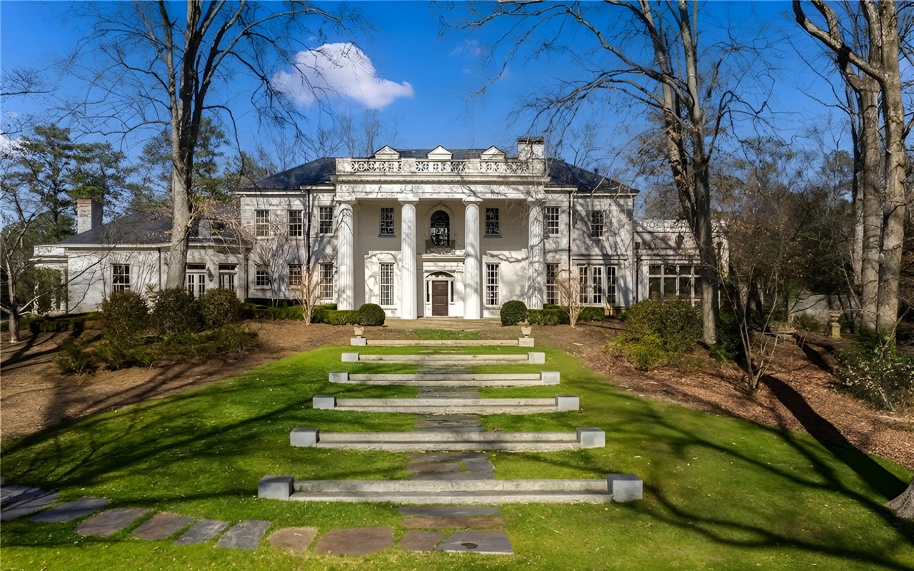
Designed by Pringle & Smith, the house at 1145 Paces Ferry Road was a grand house with a nice solid Greek Revival design featuring the four columns across the portico. But it was built as a family house and not an ‘estate’ per se.
As West Paces Ferry evolved, the house on the corner of Randall Mill Road gained a position of prestige. By the time the current owner bought it, it was among the grand estates lining Atlanta’s most famous residential road.
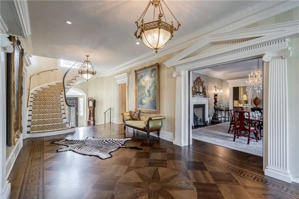
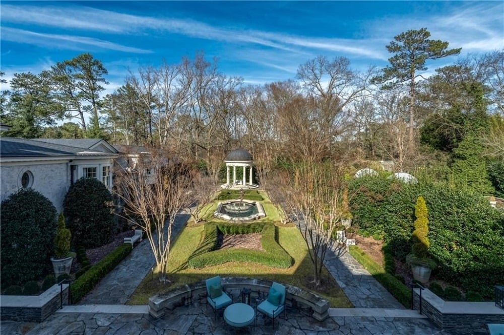
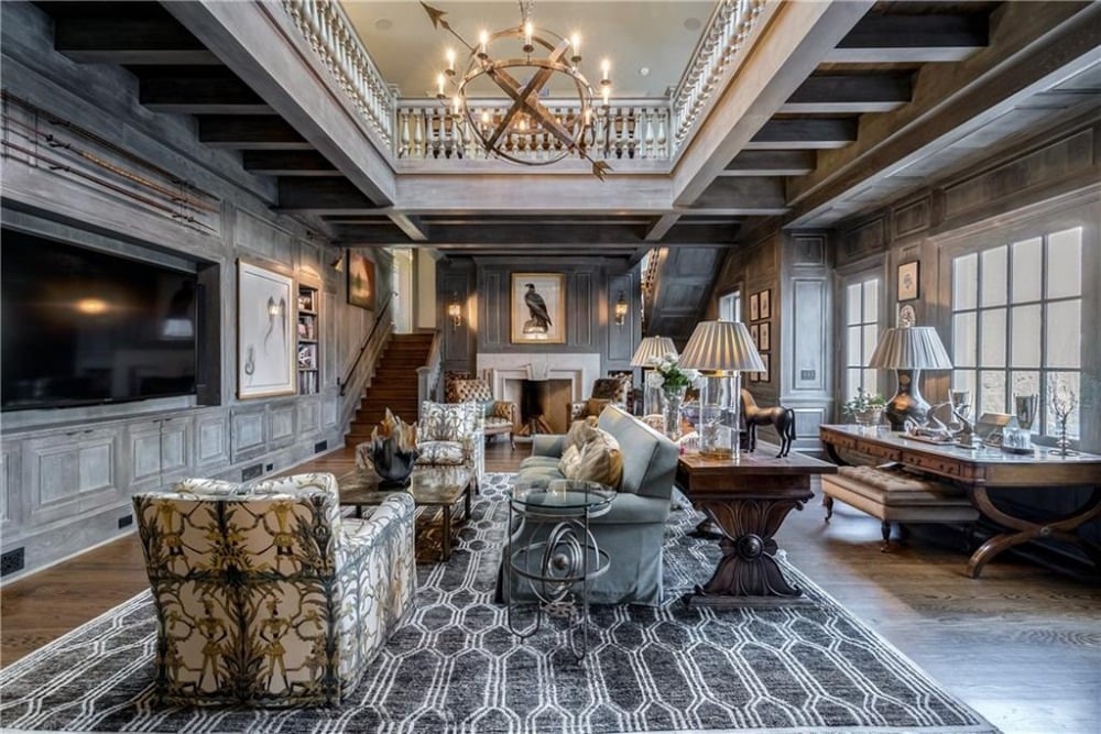
That owner, the late James Arthur Adams Jr., had an uncompromising vision of what the house could and should be. For a decade, he brought in some of the best builders, designers, artisans and architects to see his vision to fruition. The result is a stunning nearly 13,000 square foot masterpiece, completely updated with a focus on the home’s history and surrounded by four acres with pocket gardens, pools, statuary and rolling green lawns.
Shanna Smith and Ginna Dunlap with Dorsey Alston, Realtors have the estate listed for sale.
We asked some of the people involved with the transformation about White Oaks, their initial perceptions and how it came to be one of the premier estates in Buckhead.
Bobby Garrett of The Garrett Group was the builder. Architect Laura Howard originally became involved through her affiliation with Keith Summerour. She later continued working on White Oaks with her own firm. Landscape architect Spencer Tunnell of Tunnell & Tunnell worked on the design of the gardens for the last five years.
What was your introduction to 1145 West Paces Ferry, and what were your initial impressions?
Landscape Architect Spencer Tunnell: I’ve known the house since I was a child and always admired the presence it had — the elegant columns contrasted with the lush green lawn and magnificent oaks. I watched with interest as the renovation work on the place began and then stopped during what I believe was the financial crisis of 2008. I was brought on to the team when work restarted in 2013.
Architect Laura Howard: I was working with architect Keith Summerour and we both met with the owner, Jimmy Adams to discuss a renovation for the house. I was struck by the Greek Revival elements, the strong portico and the handsome detailing. But between the original owners and Mr. Adams, White Oaks had been used as a designer showhouse. The spaces were chopped up, especially upstairs. There were lots of small spaces that were loaded up with faux painting on the walls; fake Italian plaster cracks, that sort of thing. It was disjointed. The main rooms were as they are now, but the rest of the house was not a cohesive unit. A kitchen had been added, but again, in a pell-mell addition.
The goal for me became ‘how to turn this grand house back into a grand house’ — the house living into it’s full potential. Over a bit of time, it became clear that Mr. Adams had a complete vision of creating something very special with this house. While the overall architectural design and logistics were in our court, the extensive vision was driven by Mr. Adams.
The Jones’ completed White Oaks in 1926. How is the house relevant today?
Builder Bobby Garrett: Proper traditional architecture does not really change over time. Maybe a slight evolution but many details we provide today are duplicated from the classical era of the past.
Atlanta is one of the better cities to take on renovations of this type. Material choices were limited 25 to 30 years ago, but the advent of the Internet has opened the doors to search and find product worldwide. If the architect is talented enough to design and draw details correctly, and Summerour and Howard had the ability and staff for traditional architecture, making or finding materials and products isn’t that a big a deal anymore.
Architect Howard: The house was designed by Mrs. Jones and Pringle & Smith to be a family house. White Oaks was always a house that was lived in – it was full of life, of a busy family in its day. The house is designed for living and entertaining, especially entertaining in the gardens.
What can you tell us about those gardens and the landscaping?
Landscape Architect Tunnell: The original site plan was done by Pringle & Smith. The drive went past the front porch and wrapped around the back. I believe landscape architect William Pauley was also involved. This all changed with the garage wing.
The temple was part of the original layout from the 1920s. The fountain and statue were all there when I came to the site. We removed big evergreens that swallowed much of the big addition on the west side of the space. We added perennials; white, yellow and blue, to try to bring some romance to this section of the property. We also added the herringbone hedge forms in the borders and crepe myrtles along the paths. There was a need for some kind of shade for our long, hot summers.
A landscape should be looked at as an art historian looks at a painting. What is in the foreground, what is in the middle ground, what is in the background? There wasn’t enough in the middle ground of this space so that the temple felt much closer than it is and the space felt smaller. I wanted to add some of that to the place. Axes (plural of axis) are great but there needs to be some contrast to the masculine structure and order.
How do you bridge contemporary design with a house that is almost a century old?
Tunnell: Carefully.
What was challenging about the renovation of White Oaks?
Garrett: Renovations on that scale, from homes built during that era, are always a challenge. The largest challenge on that project was the amount of detail. Every wall in every room had a detail to contend with in some form. The plans were two years in the making while construction was underway, so long term planning was a challenge as well.
From where did you draw inspiration in terms of that original design?
Howard: The strong lines of the Greek Revival design pretty much guided the design inspirationmoving forward. The front portico was going to remain as the signature element of the design. The original house had nice details, such as limestone headers engraved with the Greek key over the windows. It was a handsome detail that we incorporated into the new work.
Classical architecture is a living design. Therefore it is definitely relevant in our day. That spaces, while perhaps ordered and symmetrical, may be used for certain purposes for one generation, the same spaces can be switched up to be used for different purposes by a later generation. Walls can be opened, but flow and classical axial arrangements can be used to enhance modern design.
For additional details, photos and virtual tour, please visit the property page.
